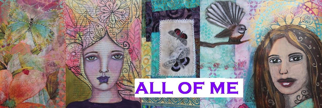
BOD : Sweetness
I won Book of Days semi-annual for July-December with Effy, and I'm loving her weekly lessons and the FB group. This is the first spread I've got completed in my journal from the first main lesson in July (week 27). I am working this year in a recycled art book that I bought at a library book sale for only a few dollars. This is what it looked like in June.
This means that sometimes I get blank pages, and sometimes I get pages full of text.
I really love the look of that in my background so I always just start on the next page, even if a face falls on such a busy background. After drawing in the face and initial lines, it was time to block in colours and while sometimes I want to challenge myself to try something different, this time I just wanted to use my favourites, as seen when I created my Art Symbols Dictionary. Effy talked about using Tombows with iridescent medium to get a shimmery paint. I pulled out my Tombows and Aquamarkers - again my stash of these consists of my favourite colours plus a sensible brown for eyes ;-)
I did the pink with the tombow and the orange with the aquamarker and they both worked well with the medium. The other areas were too large to waste my markers, so I mixed dark purple paint with the medium, and then turned to my trusty iridescent paints for the turquoise and lime sections

Then we did the face in detail - I have been thinking prismacolors might go on my Christmas wish list since I have lovely watercolour pencils, but not permanant ones. However, I made a visit to our local art supply store (Ochre Art Supplies in Square Edge) and found I could buy Faber Castell Polychromos pencils individually. I bought 3 that I thought would be useful for face shading, and love them. Upon reading reviews, I have bought a brand that is fabulous - very expensive - but if I'm only going to buy them individually as I feel I need I am happy to do that, rather than spend $60 on a box of pencils that may contain colours I don't use. Anyway - here's how I shaded my face using Derwent Graphitint Slate Green and Ivy with water in the eye, and the Polychromos for shading - I rubbed with a blending stump, and later applied white paint in some areas.
Then the doodling began...Hair in progress.
Serendipity - the words grace and beauty were part of the background text so I kept them from the very start to inspire the entire piece. The theme for this lesson was Sweetness - I love the sweetness of creating with colours and symbols that make me happy. From a stressful week, I moved to the sweet spot that comes whenever I'm creating. I used a mix of doodles and my new stencils with gold in my colour block areas
I was thrilled with the look I got with my new star stencil in the sky area, and couldn't resist adding white pen dots for extra sparkle
It was worth doing this page after my art symbols spread. I felt that process added to the depth of meaning in this spread. She's all done here - all that shimmer makes me happy ♥
The time this lesson took was so worth it - I am very happy with the finished spread. Click on the photos to see them larger.
See the rest of my spreads in this year's art journal HERE.


Marvellous page! I like how the text shows through just enough so it's not too distracting. I definitely recognize Effy's influence in this, but still in your own style. Lucky you to have won! I bought Effy's original Radiant class a while ago (on a whim when it was half priced), downloaded the videos, but never watched them (shock, horror!) Just didn't have the time, but it's good to know I can still watch them any time I want.
ReplyDeleteThanks - I love the text too. I enjoy her art style - it is quite closely aligned to what I enjoy. Hope you are having a lovely creative week. We start hols next week so am looking forward to some play time
ReplyDelete