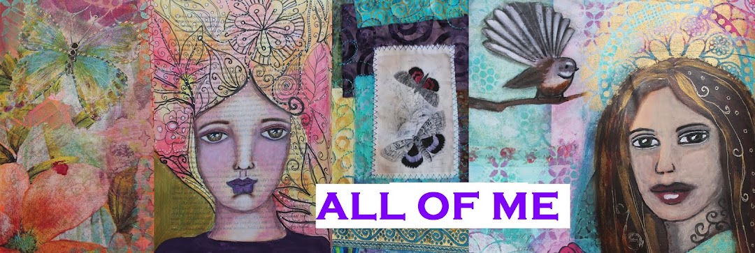
Journal Cover
If you follow my blog, you will know that I've been doing both Life Book AND Documented Life projects this year. Mostly they've been separate, except in my very first week when I combined the bonus lesson of the tag (by Roben-Marie Smith) from Life Book
with my Documented Life spread.
I've not been as creative as I'd like lately, but I got my creative mojo back this last couple of days and it came from combining those projects again...My Documented Life spreads are created is this large Dylusions journal :
Only criticism - the stretchy elastic closure band came off only a couple of months in so I'll have to use something else to keep it closed...no biggie.
I've been waiting for creative inspiration to strike before I tackled the cover. That happened this week when I watched Life Book lesson week 39 by Roben-Marie Smith. I decided this was the perfect inspiration for creating a lusciously layered cover. I guess having no band actually makes it easier - just have to cover up those wee metal circles that held the band. I realised fairly quickly that I needed to add a layer since my background was brown instead of white - so out came the gesso.
Then Roben-Marie used watercolour - I love the soft look, but they don't behave as I'd like on the white gesso. Solution - using some lovely soft metallic paints - I know they're fairly expensive (the lumiere brand is anyway) for a layer that will mainly be covered up, but the colours make me happy and there's no point in having supplies that you don't use - right?
Time to layer some collage. I love to use paper serviettes and was thrilled when I started to peel this one apart to discover the soft print of the middle layer
Ended up using just that layer rather than the darker black - love the ethereal effect as it blends over lower layers
Click on any photo to enjoy the details larger
I love using all different kinds of papers in the layering, including inky underpapers from other projects. As the layers continue I feel happier
and happier
The highlighted definition there is the word Nourish - my Word for 2015. Important for me to have that included on the cover and a good reminder for me to think about that again at this stage of the year. The other new focus for me to explore this year in art journaling has been Faces. I really need to include some on my cover. In Week 31 of Documented Life, you may remember that I re-used a face from a previous spread by copying it, re-sizing, printing on photo paper and then repainting it onto the page. So I copied a couple of faces and did that again.
The one on the right is from my Inner Artist Guardian (a Life Book project) - I left her as is. I think maybe because in the original she had the word Nourish included so this felt right.
Interestingly, the face on the left was the one I mentioned above that I originally altered! See her originally created HERE for Documented Life Week 28, and again I felt the need to alter her for the cover.
A bit deeper colouring, and I especially like how the purple metallic dots added to her new look. And I'm done and very happy that I indeed have luscious layers :-)
Front cover :
Back cover :
Spine view :
The entire spread :
Click on the photo to enjoy it larger or see it in the Flickr album I've created for all my Documented Life 2015 spreads HERE. There's also a Flickr album for my Life Book projects HERE. And you can see all my posts about Documented Life and Life Book by clicking on their respective titles.
Next up - what to do with the inside front cover....


No comments:
Post a Comment
Thank you so much for leaving a comment. I will always respond to you so check back here in a couple of days.